Exploratorium Identity
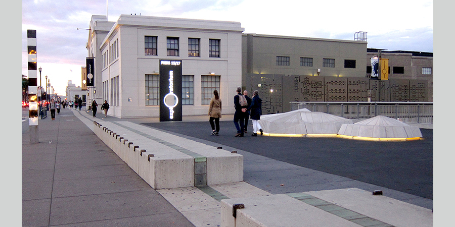
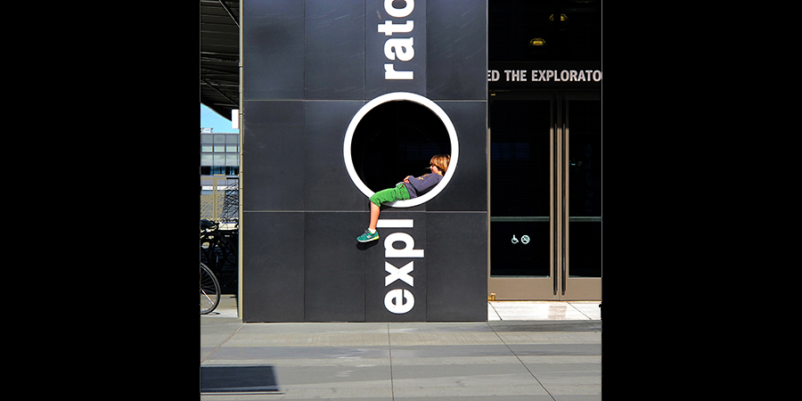
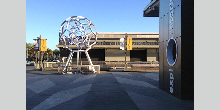
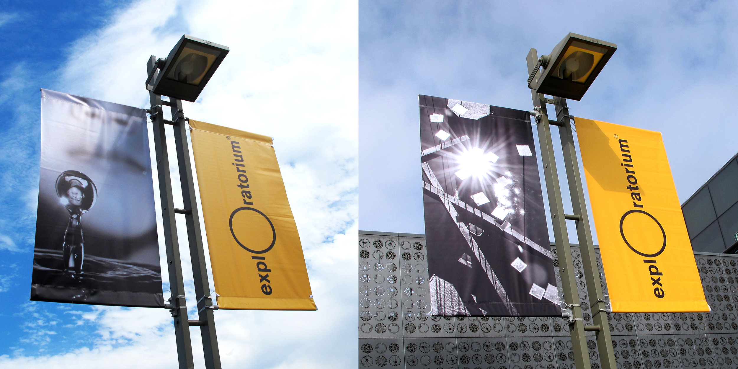
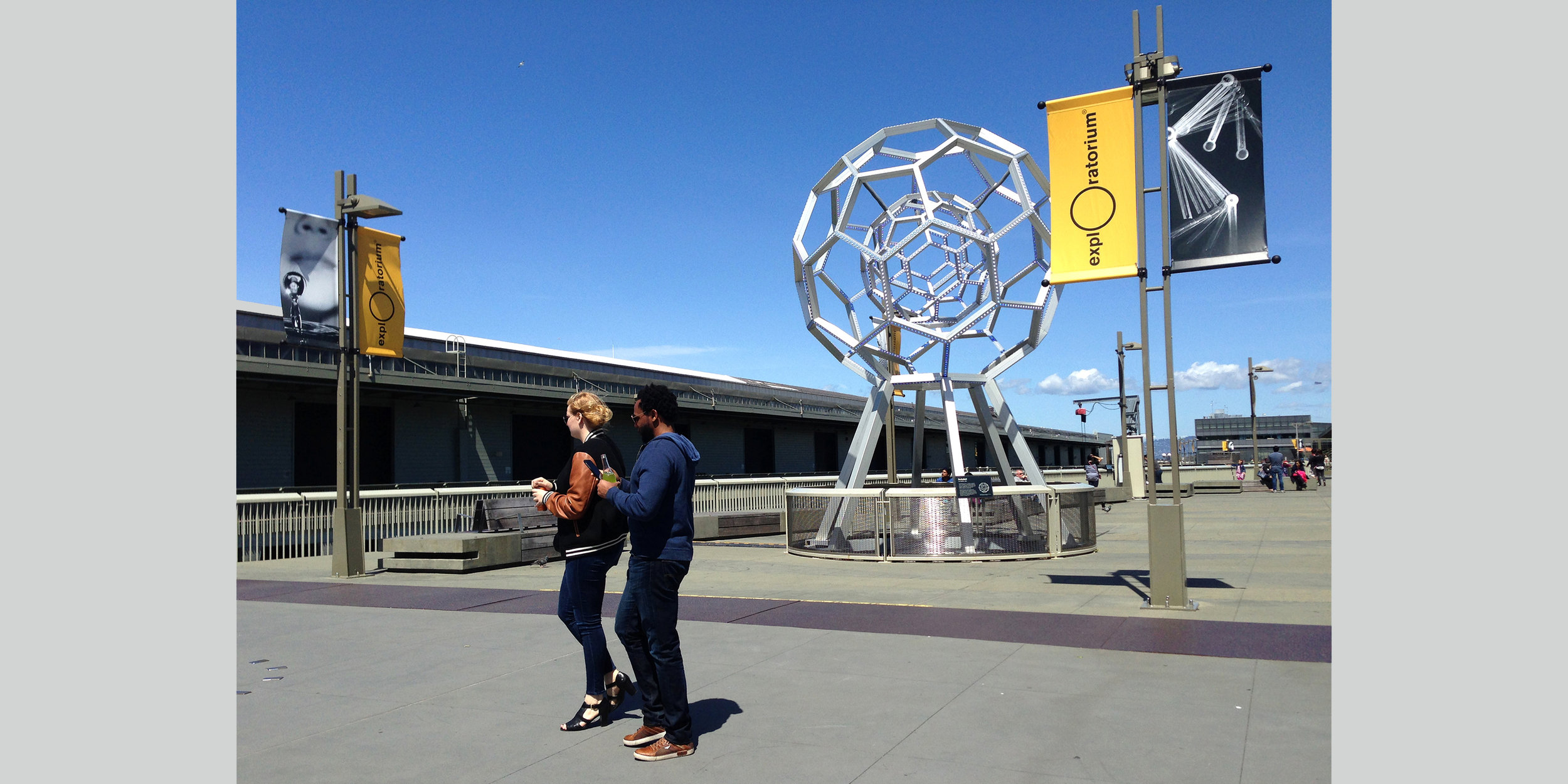
The oversized "O" in the Exploratorium logo is a symbolic "opening" into direct experience. It is intended to be an invitation for visitors to find “anything and everything” interesting. Beyond that, it represents the founder Frank Oppenheimer’s philosophy of empowerment; the intention that each visitor feel free to explore, respect their own perceptions and make their own meaning from experience. I worked directly with typographer Erik Spiekermann to create the EXPLO Font, including a stencil version based on “found typography” at the Pier 15 building. As a Creative Director, I worked on increasing the consistency and creativity of the museum's graphic identity.
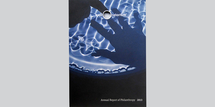
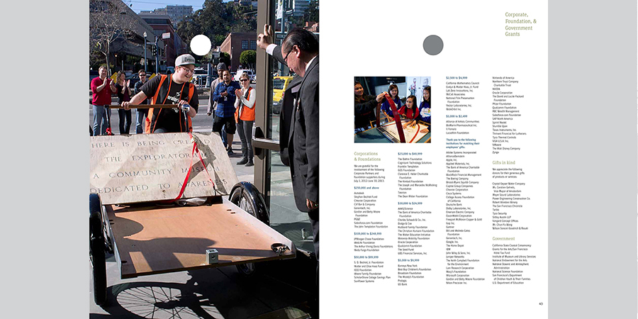
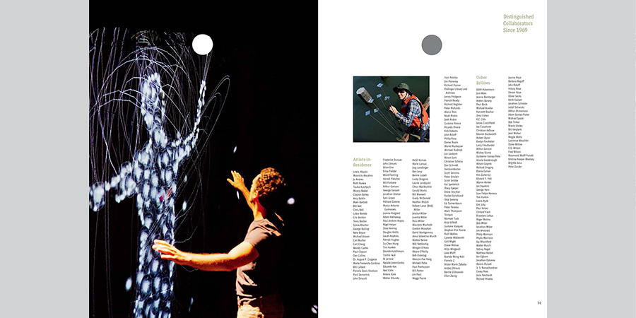
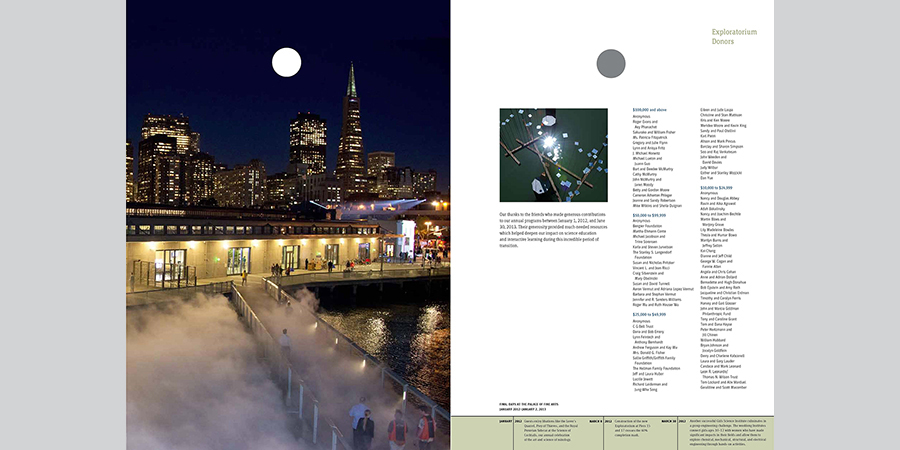
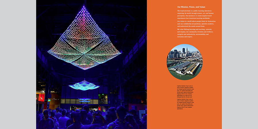
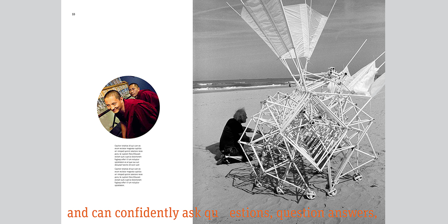
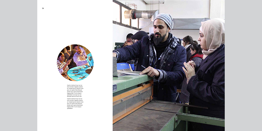
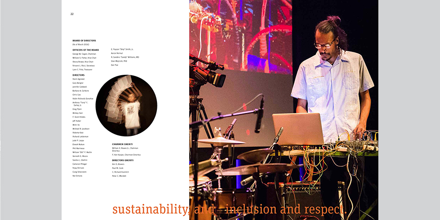
The museum logo was sometimes expressed as a physical hole, cut through signage and die cut through business cards. Here a hole is die cut through an entire over sized annual report, including the covers.
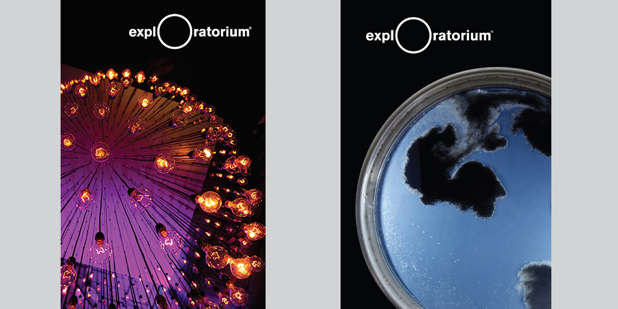
The logo is suggested by the circular aspect of various phenomena, in a series of donor collateral.
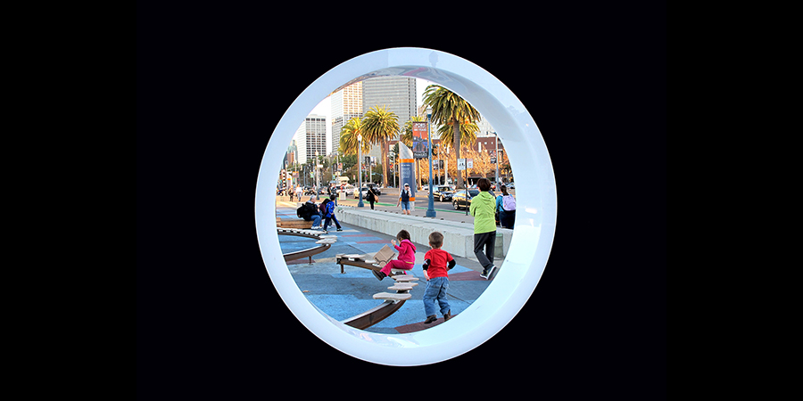
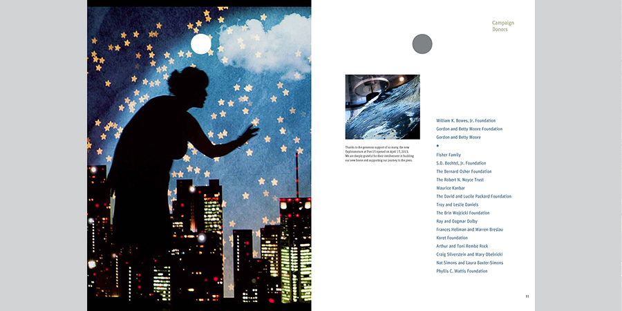
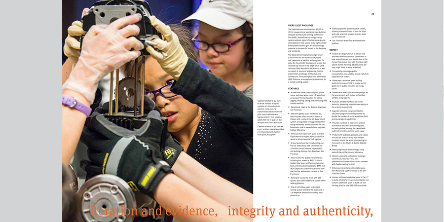
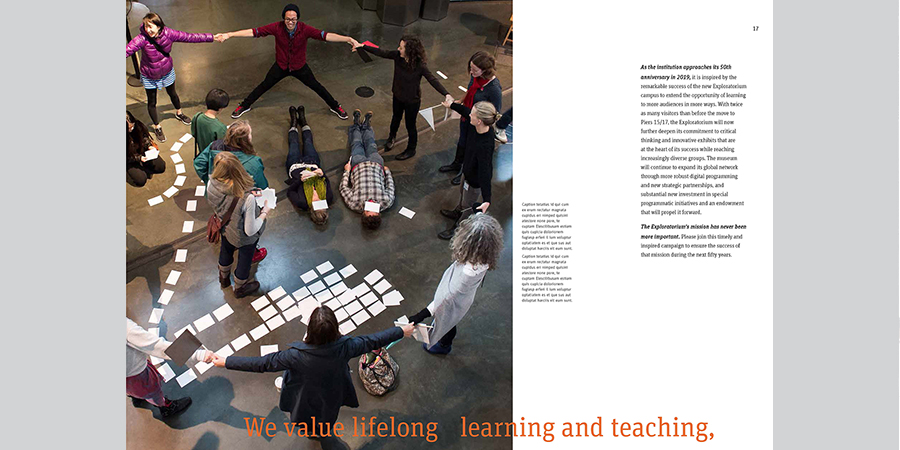
The logo becomes a “portal” view through a circular frame in a oversized capitol campaign brochure.
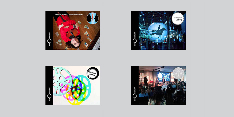
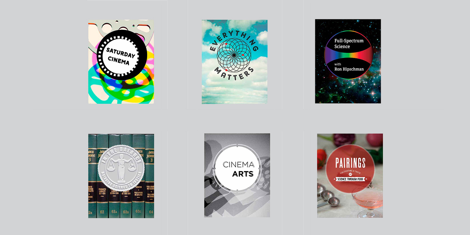
For many years, the anarchy of the Exploratorium meant embracing internal eccentricities. One of my challenges was to gradually reinterpret the many disparate public program identities, to move toward a “family resemblance”. The collection of different programs are confined to a circular shape, but still feel like a box of chocolates.
Identity:
Logo Guidelines
Campus and Signage Guidelines
Annual Reports
Capitol Campaigns
Identity systems
Membership
Development
Public Programs
